
The Hunting of the
Snark is one of those pieces of writing which invites illustration. Like
Carroll’s other famous work of ‘nonsense’ fiction Alice’s Adventures in Wonderland, the Snark is filled with both the bizarre and the familiar. The
basic narrative follows a group of unqualified hunters seeking the eponymous
Snark – some kind of exotic animal I imagine. However, it is the hunters
themselves that are of importance here and their characterisation is perhaps
what lends this tale it’s strong visual quality. These characters are a
ridiculous and pathetic ensemble of men, yet they are all in some respects
familiar; in their fears, their obsessions, and in their societal roles – none,
it should be noted, suited to hunting. Of course, it is the juxtaposition of
the familiar with the strange which helps establish Carroll’s adventure as
nonsensical.
I realised at one point that both N. and I have a copy of
the poem illustrated by different artists so I thought it would be good fun to
look at the two approaches taken by each artist to Carroll’s poem and see how their
differences impact our reading of the work. The copies we own are illustrated
by Mervyn Peake (a favourite author and illustrator of mine – full disclosure)
and Tove Jansson (well known, of course, for her classic children’s books about
the Moomin family).
Let’s start with Peake’s illustrations. These are perhaps
the most straightforward out of the two and most similar to those of Henry
Holiday who illustrated the first commercially available edition. Peake’s
approach to the characters is more naturalistic than Jansson’s; but only in
that they are clearly human (and beaver) rather than the fantastical creatures
of Jansson’s unique imagination. Despite their human form, Peake’s characters
are still rather cartoony- taking on a sort of theatrical melodrama in their
body shape and expressions. I particularly like his approach to the Bellman,
whom he physically elongates and depicts as a younger man than Holiday’s more
famous characterisation as a bearded sailor. Perhaps taking cues from Carroll’s
line: “said the Bellman, whose face/Had grown longer at every word”, Peake
stretches his whole body out into a comically gangly figure (looking not unlike
Hugh Laurie as Bertie Wooster). This is pushed to its extreme in Fit the
Fourth, where Peake shows the Bellman spread out on the floor, swooning perhaps
from the exertions of the hunt. I particularly like Peake’s take on this
chapter as, while there is much going on in the poem, his illustrations show
both the Bellman lolling about on the floor as well as the Banker (I think),
fork in hand, looking for the Snark. The Banker, seen from behind (as he
politely hides his fork, perhaps in the hope of coaxing out the Snark) appears
rather hesitant in his attempt. In both these characters we see them not
embroiled in an adventure but rather as hesitating, or dally before the
prospect of risk.

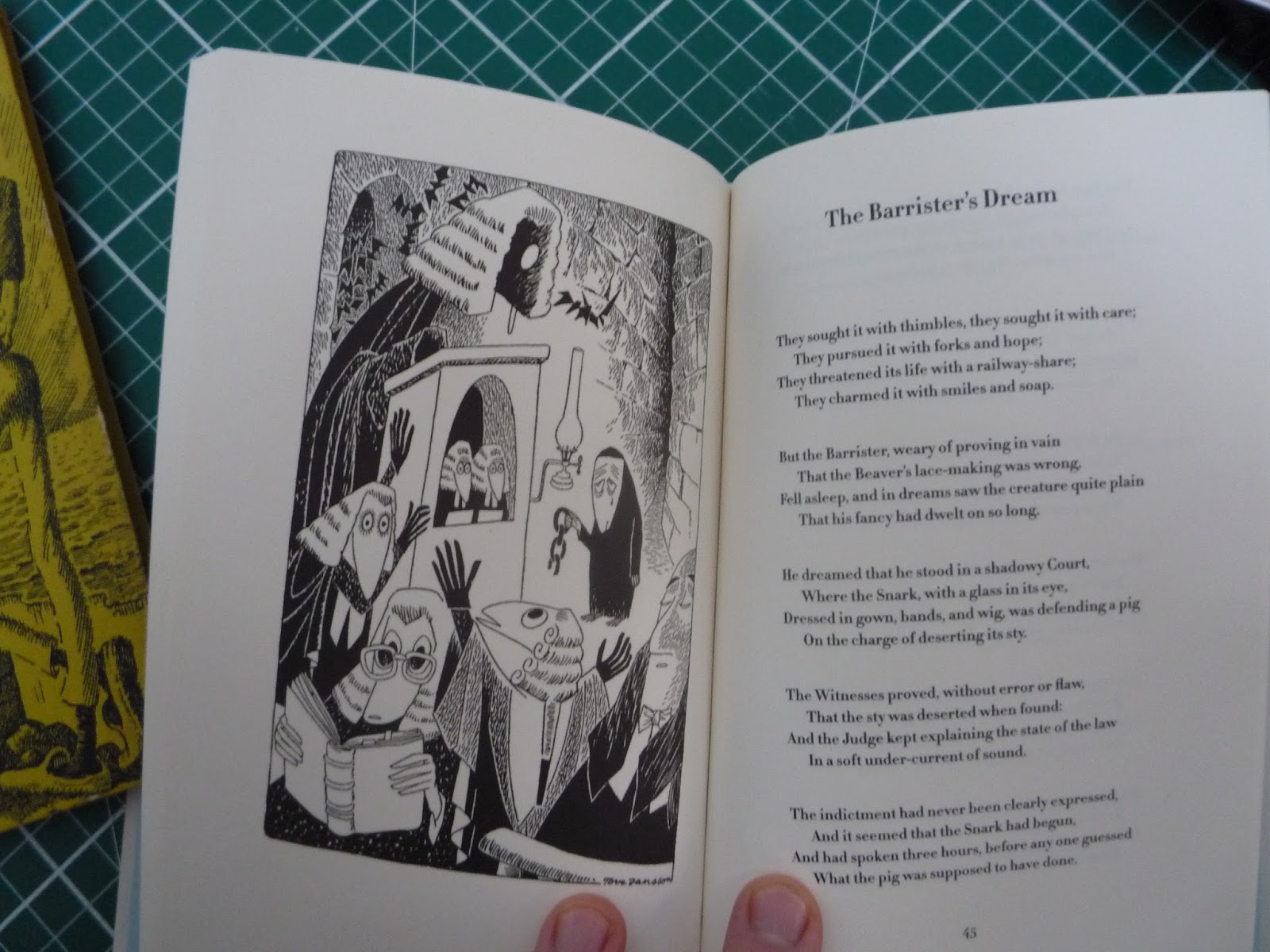
We see Peake continue this approach to events later on in
the narrative in The Barrister’s Dream.
In this sequence the Barrister has a surreal dream in which “the Snark, with a
glass in its eye/Dressed in gown, bands, and wig, was defending a pig”. Rather
than do what Jansson does, which is to depict the surreal composition of the
scene, Peake gives us a smaller illustration of the Judge, who becomes nervous
and unsure (bullied perhaps by the Snark). Once again Peake depicts the more
relatable human qualities of the characters amidst bizarre events, lending them
a further strangeness. What’s not strange about an apprehensive Judge?
Jansson’s illustrations were originally published in Sweden
in 1959 but according to the copy we own, published by Tate Publishing (2011),
it wasn’t published with the original English text until Tate presumably bought
the rights and published the book fifty years later. As mentioned above, they
are a lot more fantastical than Peake’s and even the earlier Holiday
illustrations. They are reminiscent of her Moomins illustrations, depicting the
crew as humanoid, snouted creatures. In some respects I feel like this reduces
the nonsensical aspect of the events. It seems (however irrational this may
sound) far more believable for non-human fantasy creatures to be on a
surrealistic adventure after an unreal exotic beast rather than an actual
butcher, banker, etc. Jansson’s approach therefore feels much more grounded in
the fantasy elements of the poem rather than the nonsense of it.
Perhaps partly due to this more fantastical approach Jansson
is able to create a better sense of the island as a place. We’re given an
establishing image of the island, providing among other things, a sense of
scale; with the hunters as little figures beneath the looming, terrifying
mountains and steeps. This image of the island of one of hostility and fear,
and I can’t help but be reminded of the Night
on Bald Mountain sequence.

Jansson’s approach is much more compelling in terms of
building a fantasy location and cast of characters; however I feel like Peake’s
illustrations are more in the spirit of the poem’s nonsensical whole. The
characters are physically more human and their expressions and stances, though
wildly strange in the circumstances (as of course they should be given the
material he’s working with), are more familiar, giving the poem that further
element of human drama and tragedy - which
the poem itself conveys well despite being ‘nonsense’. That said, I would also
argue that Jansson’s illustrations have aged better. Her unique
characterisations (as we see in the Moomin books) are timeless and without a
doubt I would say that her illustrations make this admittedly strange poem much
more accessible and fun for younger readers.
No comments:
Post a Comment